Chandler#81 Posted June 14, 2016 Share Posted June 14, 2016 26, Charging. I think a lot of people like the standing simply because it's original. Buffalo has always been an old school city, proud of our past. Which is why after a decade and a half of experimenting, the Sabres just went back to the classic emblem. I think anybody given the two options, not knowing what either one was, would pick the charging buffalo.o Also, wearing Bills gear outside of Buffalo, nobody knows what the standing buffalo logo is without "Buffalo Bills" printed on it. Punk-azz whippersnappers. All of 'em! Link to comment Share on other sites More sharing options...
Mike in Horseheads Posted June 14, 2016 Share Posted June 14, 2016 26, Charging. I think a lot of people like the standing simply because it's original. Buffalo has always been an old school city, proud of our past. Which is why after a decade and a half of experimenting, the Sabres just went back to the classic emblem. I think anybody given the two options, not knowing what either one was, would pick the charging buffalo.o Also, wearing Bills gear outside of Buffalo, nobody knows what the standing buffalo logo is without "Buffalo Bills" printed on it. TRBJ... you have to admit the squid the Sabres tried needed to go! Link to comment Share on other sites More sharing options...
KollegeStudnet Posted June 14, 2016 Share Posted June 14, 2016 Would dig an alternate red helmet once a year. Eventually it will happen Link to comment Share on other sites More sharing options...
BUFFALOKIE Posted June 14, 2016 Share Posted June 14, 2016 I'm 32 have only been following the Bills since 2002 and I am FIRMLY in the lingering camp. I'm 43, been a Bills fan my entire life. Charging. Link to comment Share on other sites More sharing options...
machine gun kelly Posted June 14, 2016 Share Posted June 14, 2016 Charge - 48 (my age) Grazing fun for throw back games, just never bring back the 2000's jerseys. Ugghh! I do like the old white jersey, blue pants. Link to comment Share on other sites More sharing options...
Punching Bag Posted June 14, 2016 Share Posted June 14, 2016 Charging or Lingering Buffalo, which do you prefer? The question is worded like some huckster's game slanting results in favor pollster wants. Charging has a positive connotation while lingering has a negative. Pass. Link to comment Share on other sites More sharing options...
IronyAbounds Posted June 14, 2016 Share Posted June 14, 2016 The standing Buffalo - too cool to be fazed by anything. But then, I have a soft spot for all the old AFL logos. I so wish the Titans had allowed Houston to keep the Oilers name and logos when they left for Tennessee. The Oilers logo was cool and I think the expansion franchise would have used Oilers if allowed. I like the old Pats logo far more than the crap they have now. The Broncos might be the one exception, but then the Broncos experimented with vertical stripes on their socks, so they were kinda goofy anyhow. Link to comment Share on other sites More sharing options...
hondo in seattle Posted June 14, 2016 Share Posted June 14, 2016 The standing Buffalo looks like lunch! It's just grazing in the pasture waiting for someone to slaughter it and turn it into bison burgers. I'm 57 and prefer the charging logo. The charging Buffalo looks like it wants to fight. Link to comment Share on other sites More sharing options...
BobbyC81 Posted June 14, 2016 Share Posted June 14, 2016 Charging is a tasteless 70's design...it looks like some sort of bitchin' flame decal on a '72 Camaro. Standing is classy, dignified- the 60's throwbacks should be the regular uniform/helmet combo. Hey, at least it doesn't look like a banana slug. Link to comment Share on other sites More sharing options...
maddenboy Posted June 15, 2016 Share Posted June 15, 2016 (edited) lingering. Standing. Grazing. Staring you down before the fight. That's what Buffaloes do. Right before they eff you up. Nothing against the charging. But the Standing is such a link with the history. Would the packers change the standing "G?" Would the bears or cowboys? Edited June 15, 2016 by maddenboy Link to comment Share on other sites More sharing options...
PromoTheRobot Posted June 15, 2016 Share Posted June 15, 2016 Both are great Link to comment Share on other sites More sharing options...
jr1 Posted June 15, 2016 Share Posted June 15, 2016 the footballasfootball.com logos Link to comment Share on other sites More sharing options...
Steve Billieve Posted June 15, 2016 Share Posted June 15, 2016 lingering Link to comment Share on other sites More sharing options...
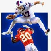
Buffalo Barbarian Posted June 15, 2016 Share Posted June 15, 2016 Charging or Lingering Buffalo, which do you prefer? um, falling? I like both logos. the question is, could the charging logo use some improvements? I think this will work Link to comment Share on other sites More sharing options...
BuffaloFan68 Posted June 15, 2016 Share Posted June 15, 2016 I'm over 45 & prefer the charging logo. Link to comment Share on other sites More sharing options...
Dr. Who Posted June 15, 2016 Share Posted June 15, 2016 Charging is a tasteless 70's design...it looks like some sort of bitchin' flame decal on a '72 Camaro. Standing is classy, dignified- the 60's throwbacks should be the regular uniform/helmet combo. I don't really hate the charging logo, but this evaluation is the best in the bunch. Link to comment Share on other sites More sharing options...
jletha Posted June 15, 2016 Share Posted June 15, 2016 28 charging Link to comment Share on other sites More sharing options...
Bullpen Posted June 15, 2016 Share Posted June 15, 2016 45 and charging... lingering, just doesn't do it for me. Link to comment Share on other sites More sharing options...
Canadian Bills Fan Posted June 15, 2016 Share Posted June 15, 2016 30...charging CBF Link to comment Share on other sites More sharing options...
Direhard Fan Posted June 15, 2016 Share Posted June 15, 2016 71 as of yesterday and been since the beginning. Charging for sure. We need to be aggressive. Go Bill's Link to comment Share on other sites More sharing options...

Recommended Posts