UConn James
-
Posts
9,046 -
Joined
-
Last visited
Recent Profile Visitors
3,889 profile views


UConn James's Achievements
All Pro (7/8)
981
Reputation
-
 It would be great if they could wear those at some point this season too. The white 64-65 throwback didn’t get officially dropped, they just stopped wearing them a few years ago. And just to note on the helmet announcement… because the regular jersey set is somewhat similar they may decide to simply wear the red helmet with them, rather than doing a full Kelly-era throwback set. The league announced this offseason that teams are allowed to have 3, or in a couple of possible cases, up to 4 different helmet shells / colors and that an alt helmet can now be paired with a primary jersey set. We’ll see if any of this comes to pass.
 -
BR has always seemed to be a reliable news outlet, right?
-
Commanders bringing back their Super Bowl era throwbacks
UConn James replied to Gregg's topic in The Stadium Wall
There’s been nothing in the rumor mill on uni sites about a red helmet alt, even tho the league is now allowing 3 or in some cases 4 helmet shells. Literally everyone wants it for a couple of games per year but the team just isn’t doing it. In the final year of Rich/Ralph/Highmark this is truly stupid and heartless. It’s what they should have done from the start. Only nitpick is that there should be a thin white border around the W on the helmet. They have the yellow bordered with white down the helmet stripe, it needed to be done on the logo too for balance & consistency. -
I was uneasy about McGovern’s shift to C (iirc from the press at the time he hadn’t played the position in a game since high school?) but his play showed just how much of a liability Morse was becoming. Amazing the difference when the interior of the line doesn’t get blown off the LOS and pushed backwards into the QB.
-
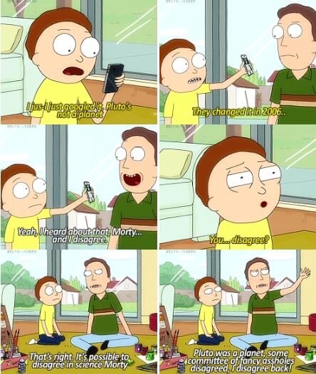
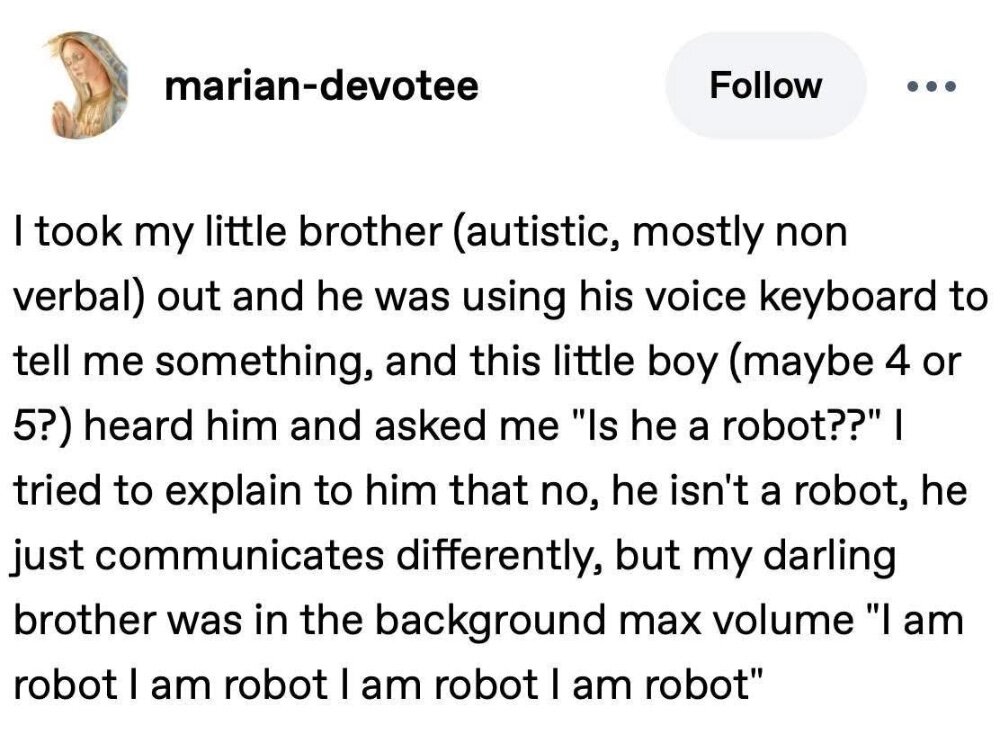
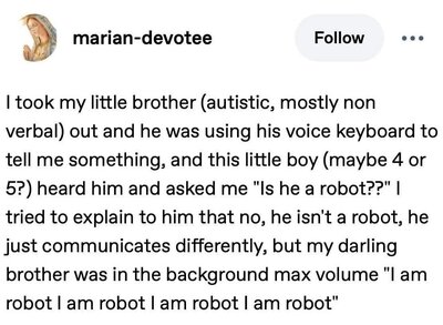
Exactly my humor. 🤖 (Note: I am on the autism spectrum.)
-
Bingo. I believe that’s from a Seinfeld quote. I have one Kelly jersey from back in those days. My others, that I’ve sewn 🧵 myself, are with my last name. I’ll never get cut from the team, you know?
-
To salvage something out of it, I’d take a seam ripper to the BILLS wordmark. (I’ve never been a fan of those things anyway.) It looks like there’s no NFL shield on the collar either? Can order a patch one on the eBay and iron on and sew. I learned how to use the sewing machine during COVID times and have done customizing on a fair few Red Sox jerseys (ordered the name letters & numbers on eBay from a guy who uses the exact team font and I assume it’s done with a Cricut machine?), a Kelly era jersey whose vinyl numbers peeled, etc. I also do the odd repair to clothing, dog toys, and other items; hey it saves money.
-
Well… consolation is that if he does develop into a decent player history shows that the Sabres will trade him for some hot dog water, whereupon he has a relatively high chance to soon win a Stanley Cup.
-
Dawkins and Torrence "snuck" into the new stadium.
UConn James replied to Draconator's topic in The Stadium Wall
Right. Also possible use for situations like lightning in the area. Seen that in college football several times. Also for kids / fan zone experience, and staging area for concerts, etc. Since the stadium will be grass, they may want to be keeping people off of it as much as possible. Frankly, I think the real grass will last maybe five seasons before there’s either a choice or league pressure to switch to artificial turf. OP is not Green Bay. -
Dawkins and Torrence "snuck" into the new stadium.
UConn James replied to Draconator's topic in The Stadium Wall
Shouldn’t this be in the Stadium Construction thread? I hadn’t remembered from any renders but it kinda looks like there’s going to be a catwalk going around the whole stadium just beneath the canopy where the metal sheets are? Or was that just the angle from down on the field? -
Does Terry not see just how badly run this franchise is? He needs to sell or bring in someone experienced who gets total control. Terrible. Terrible.
-
How to make baseball the most relevant sport again? Steroids
UConn James replied to Draconator's topic in Off the Wall
Some of the strike zone calls this year have even Angel Hernandez like 🤨. Truly egregious. And if you complain you get tossed by the guy? The challenge system seemed to work in the preseason and then it was scrapped for further study or whatever and Manfred is now hinting it will be in place next year. I say bring on the robo-umps! The Hawkeye system can make split second calls in tennis for the past 10 years. No reason they can’t make it work for baseball. 🖕the umpire union protecting these thin skinned pigs. I watch or listen on radio to a fair amount of Red Sox games. -
What do you think Ralph Wilson would think of these Bills?
UConn James replied to Billsfed1's topic in The Stadium Wall
Too expensive.- 52 replies
-
- 18
-

-

-

-

-